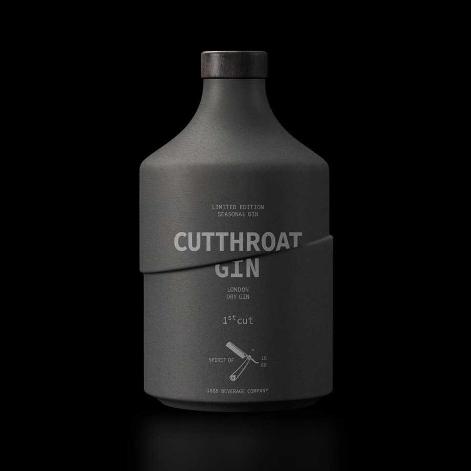
While selecting your drink of the day, what things are of most importance for you? If you said flavour then yes! The distinctive flavour of a particular beverage makes it our favourite. But one more element plays an important role in what products we try before claiming one of them as our forever. Packaging – In today’s world, alcoholic beverages come with exciting visual strategies, some would use UV rays whereas some flaunt beautiful and vibrant designs. Let us introduce you to a gin that isn’t just 10/10 in terms of flavour but also in its packaging which really is something else. Cutthroat Gin is soon going to introduce two limited edition seasonal gins and the sneak peek of the packaging is enough to get us all riled up for this launch!
Cutthroat and its vision
Cutthroat Gin is a brand that is a combination of a sophisticated steam-punk attitude and a distilling process that evolved in the 18th century. A premium brand that offers an amazing range of spirits and that’s not all. This brand is also known for tonic water made exclusively from cinchona bark sourced from India.
“This gin is the common vision of two friends. One is Canadian and the other is Greek. One is an expert in alcoholic drinks and the other in planes! We were given the name together with a plethora of design ‘instructions,’ which of course we ignored. The design idea—the container and the graphics—came about quickly, almost automatically, which is what almost always happens in our favorite works.”
By Greg Tsaknakis, owner and creative director of mousegraphics
The mind behind the intriguing design
A design agency based in Greece is the reason behind the new aesthetics of Cutthroat Gin. The soon to be launched limited editions were given a new look by Mousegraphics. This agency has won around 230 global awards and has also been bestowed with the “Studio of Year Title’ – 5 times.
So let’s dive into how the new schematics are placed in :


Both the bottles have been cut from between. No, not exactly but the bottle is designed in such a way that if you glanced at it, the 3d form would definitely look as if the bottles are slashed with a samurai blade. Precise cut and well-blended colors. The more detailed precision is the name of the brand displaying the samurai cut effects. The letters ‘A & T’ from Cutthroat are sliced at the ends and from the Gin part, the top part of G is a little bit concealed.
The back of bottle quotes, ‘A cut above the rest‘. It definitely is, isn’t it? Apart from this, the front label contains ‘ Spirit of 1888’ with a razor blade in the middle. This is to honour the distilling process used in the production of Cutthroat Gin which evolved in the 18th century.
Both the limited edition versions are differentiated as ‘1st cut’ and ‘2nd cut’. It took 2 months for the agency to create a perfect 3-D model and in total 6 months to produce a set of sample bottles. Even though the number of Cutthroat products has not been finalized yet, the agency created 6 different bottles. One out of these 6 bottles is reserved for the tonic water made from cinchona bark.
The real struggle for Mousegraphics was to decide the production material based on the cost, but they finally chose to go with glass instead of ceramics.
For more information, visit the website.


